
In this version of ContractorHUB, we’ve enhanced UI and navigation and added important insights at-a-glance. Every page is faster to scan, easier to navigate, and packed with the context you actually need, without having to dig for it.
What’s New
Spotlight Cards — the important stats, right at the top
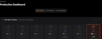
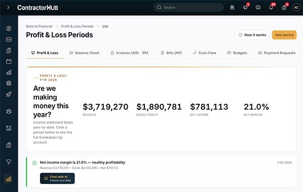
Every page in ContractorHUB now opens with a Spotlight Card: a hero section that surfaces the most important information about what you're looking at, before you scroll anywhere.
Depending on the page, your card might show key metrics, widget counts, sums, and custom calculations.
For example, on the product and supplier pages, open a supplier record and you'll see price history, inventory status, cost specs, and contact details without having to switch screens. On the crew page, you'll see crew details at a glance. No more clicking around to find the number you need — it's front and center.
Why it Matters
Contractors move fast. If you have to click three places to find out whether a sub's insurance is current, you lose time you don't have. Spotlight Cards put the critical stuff first to provide insights at-a-glance.
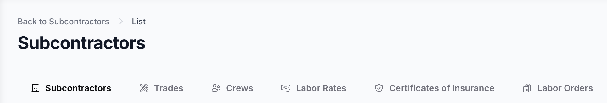
Tabbed navigation — sub-pages that actually make sense
In V3, each page manages its own navigation through top tabs instead of in the sidebar. That means sub-items (like employees, positions, and org charts under your People pages) are organized right where they belong, not buried in a side menu.
The result: you spend less time hunting and more time working. Each section of the platform feels like it has its own focus, without ever losing sight of where you are.
Why it Matters
As ContractorHUB has grown, so has everything you can do in it. Tabbed navigation keeps the experience focused, showing only what’s relevant to the page you’re on.
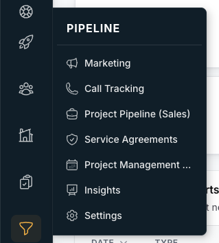
Collapsible sidebar — more screen, less clutter
The sidebar now collapses down to icon-only mode, giving you back the screen real estate to see more of the work in front of you — your pipeline, your board, your jobs. Collapse it when you're heads-down, expand it when you need to navigate somewhere new.
Why it Matters
The more information you can see at once, the faster you can make decisions. This is a small change that makes a big difference when you're working through a full recruiting board or a busy job pipeline.
Log In. See the Difference.
V3 is built to help you move even faster. Every change — from Spotlight Cards that highlight the right information immediately, to tabbed navigation that keeps things in context, to a sidebar you can collapse when you need to focus — was made to reduce the friction between you and the work. Less clicking, less hunting, more doing. This update is live now. Log in and see the difference.


