
One of the biggest themes we’ve heard from contractors in our Founders Beta is simple:
I need to see what matters today — fast.
Over the past few weeks, we’ve been refining our visual UI with that goal in mind. Today, we’re excited to share an updated experience across both Light and Dark mode — bringing more clarity, focus, and consistency to one of the most-used areas of ContractorHUB.
What’s New
This update introduces a more refined visual system designed to support quick scanning, long workdays, and real-world production environments.
Across both Light and Dark mode, you’ll notice:
Clearer focus
Selected sections stand out more intentionally, making it easier to spot takeaways, schedules, weather conditions, and potential risks at a glance.Improved visual hierarchy
Key information is easier to scan, with better separation between primary actions and supporting details.Better readability and contrast
Text, icons, and data points are easier on the eyes — whether you’re checking jobs in bright daylight or late at night.A calmer, more cohesive design
Reduced visual noise and a more consistent color system give the dashboard a professional, modern feel without sacrificing usability.
Designed With Real Contractors, From Day One
These improvements are the direct result of early feedback from our Founders Beta customers. At this stage, progress is intentional — we’re shipping early, listening closely, and improving fast.
Seeing meaningful product evolution this early is a strong signal of where ContractorHUB is headed: practical, focused tools built around how production teams actually work.
What’s Next
If you’re part of the Founders Beta, keep the feedback coming.
If you’re considering joining, this is just an early look at what we’re building.
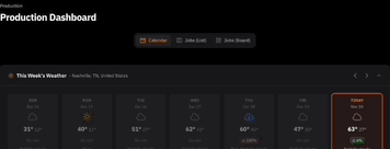
Before:
(Production Dashboard in Dark Mode)
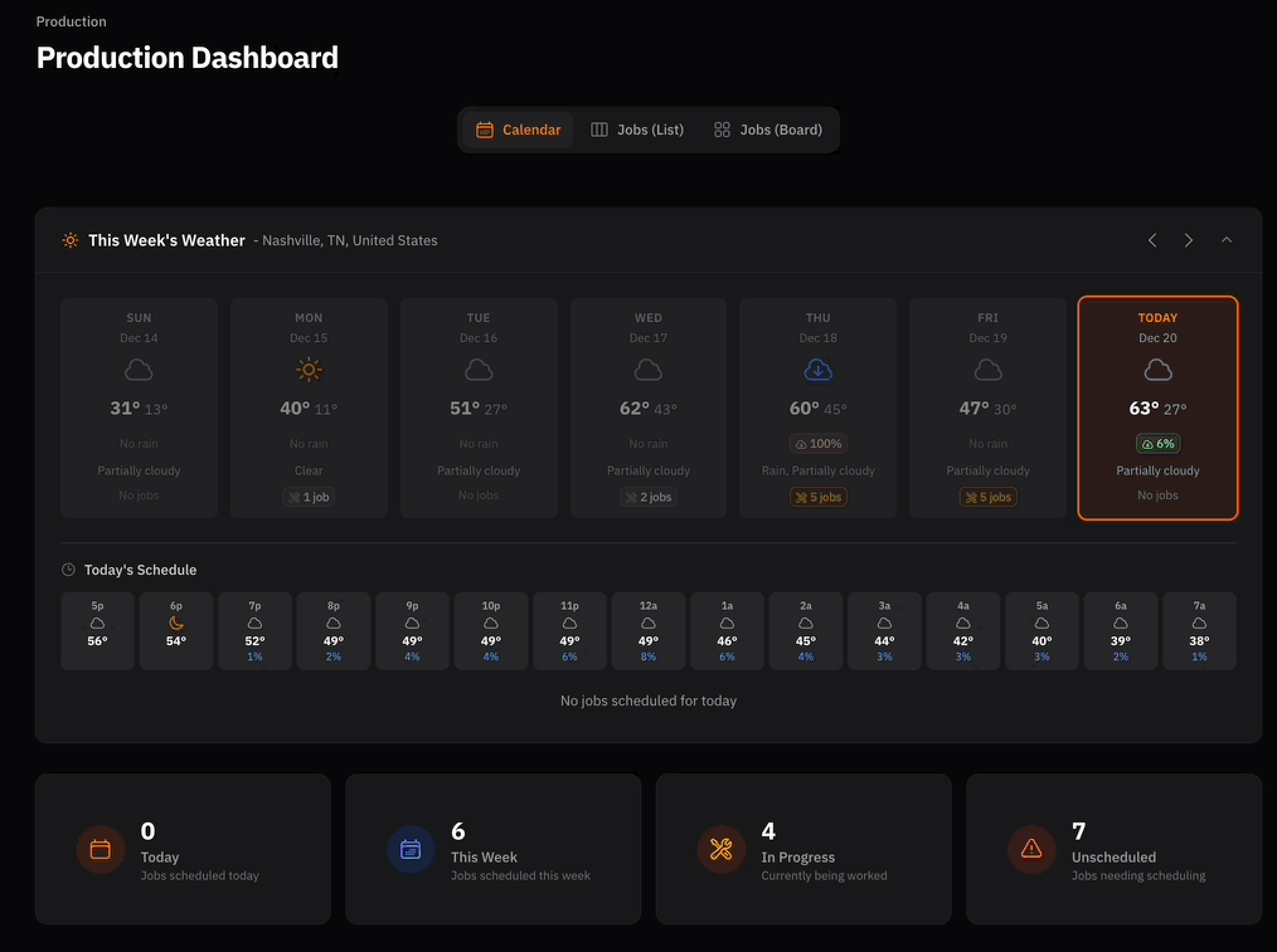
After:
(Production Dashboard in Dark Mode)
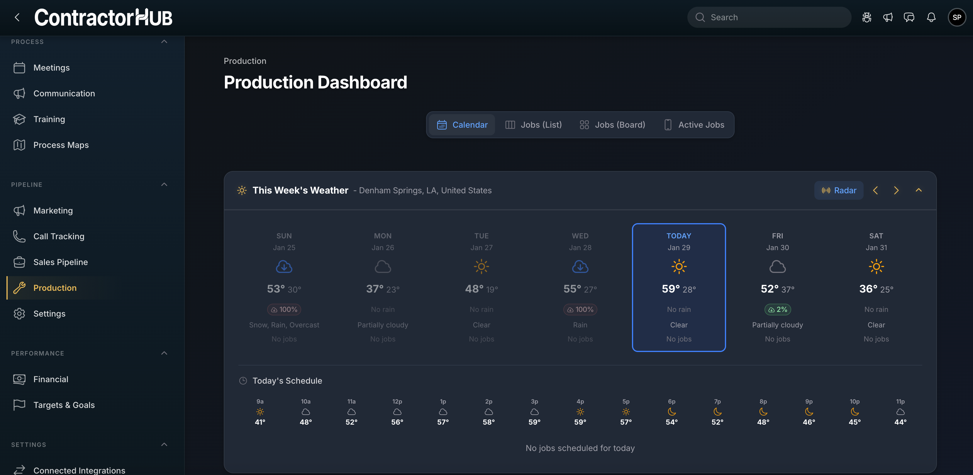
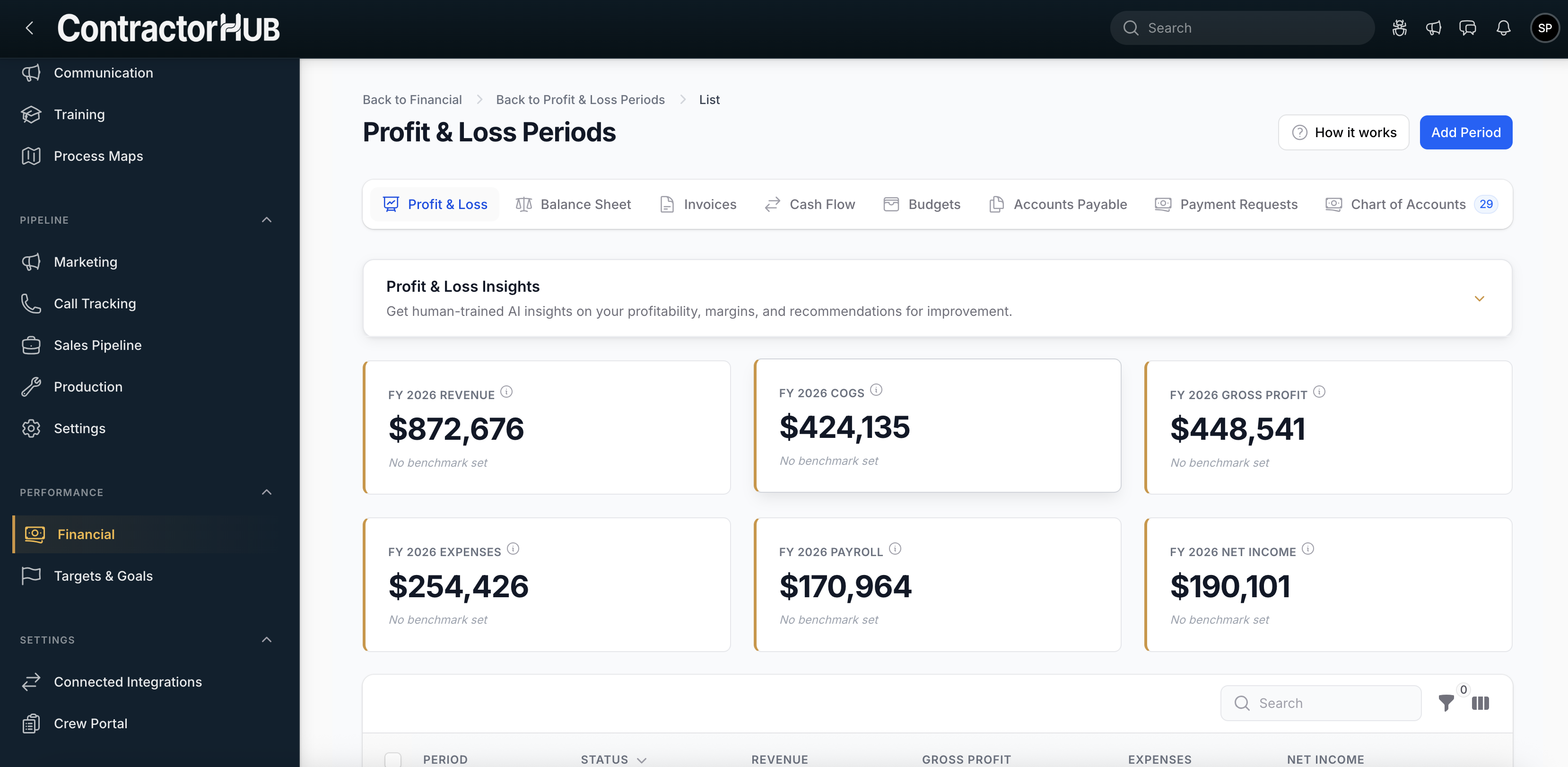
(Financial Dashboard in Light Mode)